Saturday, June 25, 2011

Design Obsession - MINIMALISM

If any of you have read some of my recent facebook posts, I am in the process of packing. After a few days of this madness, I now declare myself as a 'hoarder.' Yes, I just admitted that I have a problem. 


With just my husband, myself, and our two little boys (doggies!), it is a little excessive, and yes ridiculous that we have over 100+ pieces of china, 8 Costco sized boxes of ziploc baggies, and well, too much of everything else. It is not fun being a hoarder when you have to pack it all yourself...


In the past, I felt that every wall, corner, and room needed to have 'something' - well that 'something' now means another box for me to pack. As a new resolution, I will no longer be a hoarder. The new house is a little smaller, so be on the look out for our massive garage sale! 


MINIMALISM - is what our new design goal is going to be. Living with what we need, but a little room here and there for some fun knick knacks. Here are some inspiration photos I found of some minimalistic spaces -


image from besthomenews.com

image from besthomenews.com

image from designshoot.com - love the tone on tone whites

photo by molimodesign.com - love how it is pretty minimal, but still feels warm at the same time

But for now, got to get back to more packing...

Friday, June 24, 2011

Design Obsession - Dark Floors Part II

Obsession fulfilled! 


Dark wenge floors have been installed, and I am thrilled! Like I said before, it is not exactly the most low maintenance of choices. As you can see in the pictures, dusty shoe prints are very visible, but hey, that is what a Swiffer is for! We may live in Las Vegas, but we are still Hawaiian at heart, so no shoes in the house!


Here are a few pictures after the install-


Sunken Living Room

Dining Area

More progress pictures to come!

Thursday, June 23, 2011

Design Obsession - Front Doors

I love front doors, period. 


They make the first and most important design statement to anyone who enters. Not only does it welcome your visitors, it sets the stage to what follows next, like the preview to a movie, the first beat in a song. Although we are not doing any exterior work for now, the front doors will be getting a facelift!


Small Picture - Current Doors

Over the course of a few months now, I have been researching different front door ideas, here are a few that I had really liked...

image from houzz.com

image from urbandoor.com

Crestview Doors make really cool door kits that you can purchase on-line and install in your own interior or exterior doors. I am obsessed with them! All you have to do is purchase flush panel doors from any hardware store, and install these kits (each kit consist of inset frames and either glass or plexiglass) in which our GC had helped us with. 

image - crestviewdoors.com

image - crestviewdoors.com

Another obsession of mine from the DWR catalogue has been the Neutra House Numbers. For years I had these on my wish list, but what I was missing was the perfect house to install them on! 

design within reach - neutra house numbers

omnia industries - love the simplicity of these!

Stay Tuned!

Wednesday, June 22, 2011

Design Obsession - Dark Wood Floors

I love wood floors...


So when it came to selecting floor materials for this house, there was no question about it. I love the warmth it gives, I love the way it feels under your feet, I love the naturalness of it. 


But what tone of wood? Teak or Wenge? After much design research, and looking at our other finish selections, we chose the dark wenge - hands down. Although darker tones tend to be higher maintenance - showing every speck of dust, and eventually every dusty paw print from our two boys, I decided to just go with it...


Here are a few design examples of darker wood tones -


I love the richness and depth it adds, but it also does look more modern and crisp, especially with white walls. Floors are currently being installed, stay tuned for pictures!

Install - Day 2

As you can see in my previous posts, i have an obsession for an all white color palate.  So much, that I decided to carry it from the kitchen, into the master bath and shower. 


Shower accessories were installed today, and the frameless glass doors will go in this weekend! As a trade off for the lack of a bathtub, we decided to do a tricked out shower complete with a shower head, hand spray, and a rain head installed in the ceiling. 


Here are a few snapshots of today's install...
Hexagon Window - Original to the House

Kohler Purist - Shower and Hand Spray
Ginger Co. - Hotelier Bath Baskets

Monday, June 20, 2011

Install - Day 1

Today was the first phase of installations, I was so excited to finally see all of the pieces come together! After weeks of endless UPS and FedEx deliveries and being 'warehoused' in my current home,  the numerous fans, light fixtures and bathroom accessories finally found a permanent home at the Masters house!


Much thanks to my electrician and plumber who assisted me in this today! 


Here are a few sneak peeks - 


Kartell - E Wall Sconce at Master Bedroom

Modern Fan Company - Cirrus Ceiling Hugger Fan at Kitchen

Ginger Co. Bath Accessories - At Guest Bath

More pics will be posted soon, stay tuned!

Kellie


Friday, June 17, 2011

Another Diamond in the Rough...

Part of the whole renovation project included finding furniture pieces appropriate for the house.  Although I already have a slew of furniture at home, ranging from pieces from DWR and West Elm, I felt that this house needed some other pieces that really spoke the same language of the architecture and design palette.

I was never one who rummaged garage sales or ebay, but I became an addict to craigslist. My daily online bargain shopping for clothes, shoes, and jewelry quickly came to a halt as I became obsessed with scouring the online local marketplace for period appropriate furniture items! Like I quoted Carrie Bradshaw earlier, 'I have been cheating on fashion with furniture...'

Here are a few of my wonderful finds:

This is a midcentury dining set by Drexel, however, this is not my set exactly. A few years ago, I had found this set on craigslist for a bargain price of $65! My husband and I restored a few of the chairs, since the joints were wobbly and it needed a good sanding and coat of danish oil. The pieces are in our garage since we have not been able to finish it, and found that it is really time consuming project. I think I am going to leave it to the pros at Alex Rivas Upholstery to finish it for us.  Coincidently, this set is upholstered in a white vinyl, the same fabric that we had out seats covered in. I will post pictures of the set once it is done!
This rattan sofa was also purchased off of craigslist, but the previous owner had found it at an antique furniture shop in LA. (This picture came from their website, Woody's Antiques.) I am planning on having the cushions replaced with a creme colored fabric with black piping at the seams, and hope to use this in the living room. Rattan, which was really popular in Hawaii during the 60's and 70's had recently made a comeback, and let me tell you, in the desert, vintage rattan is extremely difficult to come by.
This console table is another vintage find by Drexel from the Profile collection in 1955-1961.  What makes this piece special is that is was designed by John Van Koert, who was jewelry designer for Harry Winston after WWII. He also designed silverware for a brand called Towle. It does need a good coat of danish oil, and the lovely silver knobs and pulls need to be polished. I am not really sure where this piece will go, but I am sure that I can find a nice home for it at the Masters house.

To me, the biggest design flaw is having pieces be to 'matchy-matchy.' The same sofa and lounge chair set with matching cocktail and side tables are a little, well...boring. Finding pieces that are different, but yet somehow go together in an overall composition is so much more fun and unpredictable! 

Stay tuned to see how it all goes together with my existing pieces! 

Monday, June 13, 2011

Patience....

It's been a while since my last post, and so much has happened since. Demo, paint, design changes, and more design changes but like I said, it is a process. For me, it's been a learning experience, putting myself in the shoes of a client's and being part of the overall execution. 


As a designer who used to work with large budgets, I was always used to just specifying materials regardless of price. However, working within my own budget, every little change or selection of materials added up quickly, very quickly!  Being part of the construction process from the beginning till now has been a great experience.


I am also learning that renovating a mid-century home has it's challenges. Electrical outlets in odd locations, lack of overall lighting (and the dislike of fluorescent lighting), prior (bad) renovations to the home... were constant add ons to the original scope. 


It's been a while since my last post, so here are some current pictures...


Kitchen - Cabinets will be replaced

Kitchen - Windows to be replaced with new double pane glass.

Guest Bath - Mirror is actually from the Guest Bedroom closet, will not be there!

Master Shower

Master Shower


Monday, May 23, 2011

THE DESIGN PROCESS...

Now I know why they say that the most difficult undertaking for any designer is to design their own homes.  We are constantly sifting through design magazines and websites looking for inspiration in which we can store in our banks of creative ideas.  However, when it comes to our own homes, where do we draw the line between what is appropriate for the home versus using it as a design lab for testing all of these ideas?


The house was a blank canvas - I had too many ideas swirling in my head, and looking back now, too many bad ideas. Thankfully, after doing more research about mid century interior design, I was able to pare down these ideas to what is appropriate for this house and the period it was built. Here are few 'rules' to mid century design -


  • No Carpet 
  • No Crown Mouldings 
  • No Granite
  • NO VISUAL OVERLOAD

Now granted, I am into the retro look- but I am not about add shag carpets or any avocado green. Instead, the look we are going for is modern comfort and finishes while keeping the overall integrity of the home. 


White Thassos and Carrera marble, dark wenge floors, and travertine (yes, it is sort of breaking the rules but it's for the guest bath and I love it.) This is the pared down version - trust me. At one point there was wallpapers and various paint colors, but I had to step away and think, 'NO VISUAL OVERLOAD.'


So there went the idea of Marie Antoinette meets Mid Century Mod. Horrible, yes I know, I did say there were too many bad ideas. Instead we are going for modern and clean - but also classic at the same time.


Classic Artemide - Tolomeo Sconces for Hallway

Sunday, May 22, 2011

THERE IS NO TURNING BACK NOW....


Matt and I did a site visit today- and with a little sigh of relief and the excitement of anticipation, we also realized that there is no turning back now! Construction and demolition is in full gear...Here is a little sneak peak of the before and current state.

Kitchen Before


Kitchen Currently - Separation wall between the kitchen and dining area removed to create a more open feel. Allows light from the kitchen to filter into the dining area and create more of an interaction between the spaces.

 
View from dining area

We also took a run to the local Goodwill store to do a little treasure hunting for some vintage finds...

 
How great are these Mid Century candlestick holders and little bird sculptures! Matt also found another vintage MacGregor golf club to add to his collection. He is planning on having them restored to display in his garage/man cave. 

Saturday, April 30, 2011

'I Have Been Cheating On Fashion, With Furniture' - Carrie Bradshaw

Maybe not as glamourous furniture, but I have been buying bath hardware like a mad woman! Being that all of the bathrooms are being gutted as we speak, now comes the fun part of looking for new towel bars and rings, mirrors,faucets, and yes...toilets. Here are a few of my finds...


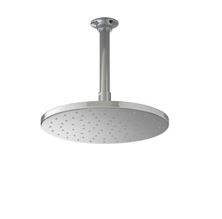
Kohler Rainshower Head


Ginger Co. TP Holder


Ginger Co. 24" Towel Bars


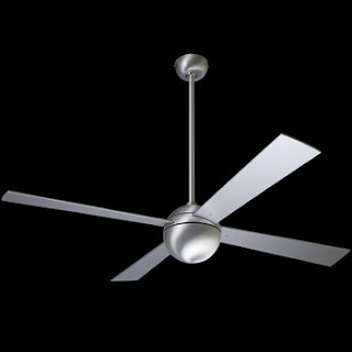
Modern Fan Co. - Ball Fan for Living Room


Modern Fan Co. - Cirrus Fan for Kitchen

I have been obsessed with these fans ever since I got the first DWR catalogue and have been dreaming about having these in my home ever since!


The Kohler Hatbox Toilet - waaaay out of my budget at $3,000 on up. But who says that looking for toilets can't be glamourous?


Kellie

Friday, April 29, 2011

The Diamond in the Rough...

Many of you may be wondering - why did I buy this particular house? It's old, needs a ton of updating, and well...am I crazy? Many years ago, during my time at the UH School of Architecture, my first year professor, Leighton Liu once said - 'When I walk into a Mies (van der Rohe) building, I can feel it in my pores.' That is exactly what I felt the instant I set foot in this house. I loved everything about it, I can't really explain, but I felt it. 

My husband knew how much I loved this house at that moment, and quickly called the listing agent to get more details. Come to find out, it went into contract that very day to someone else.  I sulked for the rest of the day, week...One month later, the house came back on the market, and needless to say, we swooped right it. 

Every house has a soul, and it yearns for people to occupy it filling it with love, laughter, and light. Without it, it becomes an empty shell, rapidly disintegrating. I deeply believe that not only did we choose this house, it chose us...

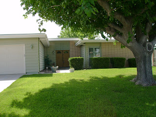
Exterior - Front


View to Front Door - With Built In Planter 


Living Room


Fire Place - Original Brick


Kitchen


Golf Course Views from Kitchen


Master Bedroom


Master Bath


Bedroom 2 - Guest Room


Guest Bath

Dining Area


Exterior - Back


Demo work has already begun, I will post some pictures soon to show the progress!


Kellie